Click here for a link to ORIGINAL article:
By William Hester, CFA, HussmanFunds | March 2010
All rights reserved and actively enforced.
With the 2009 fourth-quarter earnings season just about wrapped up, it's a good time to look forward and highlight the current expectations for earnings growth, and what it might mean for the valuations that are based on those assumptions.
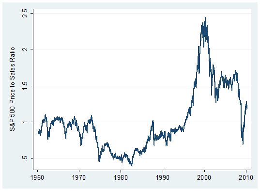
Except in relation to bubble valuations between 1997 and 2007 (which have produced flat or negative market returns [[going forward: normxxx]]), the market's valuation looks overpriced based on widely-tracked fundamentals. Whether you look at price-to-normalized earnings, price-to-dividend multiples, price-to-book values, or price-to-sales multiples, they all sit above their long-term averages. The graph below shows the price to sales ratio for the S&P 500 since the early 1960's.
The current price-to-sales ratio of 1.28 percent is far above its long-term average (outside of the bubble valuations of 1997-2007) of about .83. Prior to the late 1990's, major market peaks such as 1972 and 1987 were typically marked by a price/sales multiple not much above 1.0. Robert Shiller's cyclically adjusted P/E ratio (based on the 10-year average of earnings) suggests a similar scale of overvaluation. It's currently 21.2 versus a long-term average closer to 16. Given that the Shiller P/E reflects the unusually high average profit margins of the past decade, the implied overvaluation based on the Shiller P/E is somewhat less extreme than suggested by other fundamentals.
Since traditional measures of valuation are broadly overvalued, analysts who are recommending additional equity exposure tend to use P/E ratios based on future estimates for "operating" earnings. On that measure stocks are still overvalued, but less so. But the current forward operating earnings may be overly optimistic once you back out the assumptions they rely on. More modest assumptions would suggest that the market is overvalued even on forecasted fundamentals.
Analysts forecast that the S&P 500 companies will earn $78 by the end of this year, $93 through next year, and $106 through 2012, based on analyst estimates tracked by Bloomberg. That's an expected jump of 25 percent this year, 20 percent next year, and another 14 percent the following year. Clearly, stock analysts aren't buying the 'New Normal'.
As I've noted before, these earnings growth estimates are inconsistent with what the economics community is expecting from the overall economy. Economists are forecasting 3 percent real growth both this year and next, plus about 2 percent inflation. Corporate earnings typically grow more quickly than the economy when coming out of a recession, especially when profits take the kind of hit that they have experienced the last couple of years. But the ratio of expected earnings growth over the next few years versus expected economic growth still sits far outside of the average ratio of the two (see: Earnings Growth Forecasts May Require a Robust Economic Recovery)
But the aggressive expectations in forecasted earnings growth rates rest not only in corporate performance detaching from the economic climate, but also from corporate fundamentals veering far from their long-term typical performance. The clearest example of this is in the expectations for profit margins. While earnings growth expectations are steep, sales growth expectations are more modest. Sales-per-share for S&P 500 companies is expected to grow about 5.5 percent this year and about 7 percent next year, according to forecasts.
The difference between the growth rates of the top and bottom lines implies a forecast for sharply rising operating profit margins. The graph below is updated from an earlier piece, and includes forecasts through the end of 2012. It plots the long-term level of S&P operating margins in blue. In red, I've plotted the operating margins currently being forecasted by analysts based on their projections for sales and earnings. Last October, analysts were about half way to pricing in profit margins that matched the record levels of 2007. Now, they are just about there.
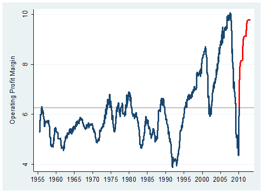
These forecasted operating margins are important to investors who rely on using a P/E multiple based on forward earnings. Even with these forecasts for near-record profit margins, valuations on forward operating earnings are not favorable. The current multiple is about 14.8. As John Hussman has noted , the long-term average P/E ratio based on forward operating earnings is about 12.
Taking the 14.8 multiple at face value implicitly assumes that the near-record profit margins assumed by analysts are now the long-term norm. Even a minor lowering of expected profit margins would cause the scale of the overvaluation to widen materially. Considering the aggressive expectations for profit margins, the market's valuation based on expected results may be as stretched as it is on trailing fundamentals.
Overburdening The Yield Curve
The slope of the yield curve has received a lot of attention lately. A recent Barron's editorial offered up the steep yield curve as a reason to be bullish on stocks. And last week two widely followed economists openly debated each other on the reliability of the yield curve in the current environment. One argued that the yield curve was nearly reason enough to become aggressively positioned in stocks. The other argued that the yield curve is less effective in a recovery characterized by wide-spread deleveraging and continuing credit strains.
As investors evaluate these arguments, there are two lessons from the data that they may want to include in their analysis. The first is that the relationship between inverted yield curves and recessions, while strongly supported in data since 1960, has less support in earlier data. This includes the 1930's, a period that shares similarities to today, if not in scale then in the characteristics of the problems. And second, stock returns following periods of steep yield curves are highly dependent on starting levels of valuation.
As an indicator of economic weakness, the slope of the yield curve began to gain in notoriety about 15 years ago after two Federal Reserve economists pointed out the tendency for long-term bond yields to fall below shorter-term yields prior to recessions as investors clamored for the safety of US Treasury notes. With two accurate warnings that followed— in 2000 and again in 2007— the yield curve seems to have taken on a special status with analysts and investors. This special status may now be overburdening the forecasting ability of the slope of the curve, especially when its use is widened to include stock performance forecasting (at least when used without additional indicators).
The graph below highlights the strength of the yield curve in helping to forecast economic recessions since 1960, and also demonstrates how the curve's track record was spottier in earlier data. To focus on just the periods prior to each recession, I've plotted the narrowest level between the long and short end of the yield curve in the 12-month period prior to each recession (using monthly data).
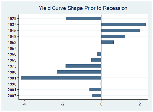
This is just one minor example of the difficulty of deciding whether to limit your analysis of the effectiveness of an indicator to post-[WWII]war data, or on an extended data set that includes periods that followed a collapse in the availability of credit. The period surrounding the 1937 recession is interesting to note. The economy was showing clear signs of recovery by most measures during the early part of 1937— it had recovered about 80 percent of the output lost from 1929 through 1933. (An exception was the decline in the unemployment rate which occurred at a stubbornly slow rate.)
But the economy would turn down in the spring of 1937— without warning from the slope of the yield curve— and the stock market fell by 50 percent. If today investors place their confidence in an inverted curve as a perfect forecaster of recession, then they must also place their full confidence in the idea that this is a standard post-war recovery and the current period shares none of the structural weaknesses that existed during the 1930's. It's tempting to think that if the slope of the yield curve can forecast economic contractions, it should therefore be able to forecast stock market returns.
The evidence here is more tenuous. The graph below shows one-year returns from periods where the yield curve was steep (greater than a 2.5 percentage point difference between long and short-term yields), where the curve was less steep, and where the curve was inverted. Using these broad parameters there's actually very little difference in the average return of stocks following periods when the curve is steep versus less steep. But even if you vary the definition of steep and moderate, the returns change very little as long as the yield curve is positively sloped. The returns during periods that follow an inversion of the curve are more distinct because they usually occur around the beginnings of economic recession (in post-war data).
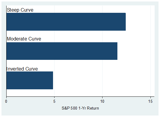
As the chart above shows the relative steepness of a positively sloped curve offers very little distinction between returns. What does offer more contrast in average returns is when you combine the slope of the yield curve and the level of market valuation. Using post-war data, when the yield curve has been steep and stocks have been favorably valued, the subsequent 1-year return has averaged almost 18 percent. When the yield curve was steep and the market was as overvalued as it is currently, the average 1-year return has been about 6 percent.
But it's important to note that this return comes with a lot of variability and steep draw downs. The graph below divides the returns that followed periods when the slope of the yield curve has been steep into two groups: whether valuations have been unfavorable (a cyclically adjusted P/E ratio of greater than 21, its current level) or favorable (a CAPE of less than 14). Instead of plotting average returns, I've included the spread of returns for each set of characteristics.
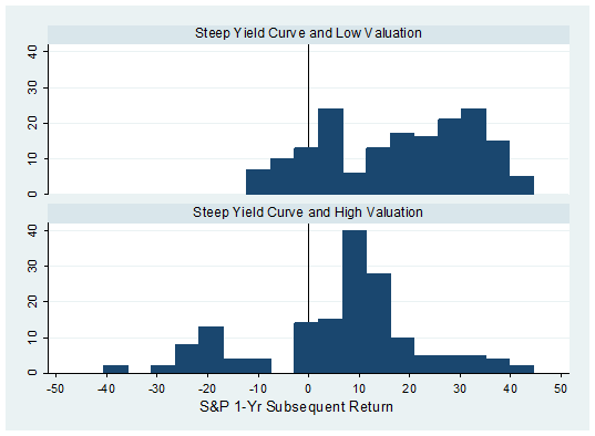
The top chart shows the favorable return profile of investing during periods where valuation is low and the yield curve is steep. This set of characteristics has produced a strong average return with limited draw down in post-war data. The bottom chart shows that while the average return has been positive [even] when the yield curve has been steep and valuations are stretched, there are important declines, some 40 percent or greater.
Both of these average returns are influenced by periods that are worth highlighting. The 6 percent average return that occurred during periods where the curve was steep and valuations were unfavorable was partly influenced by the late 2001 and early 2002 period. Here the economic recovery looked underway but the jobs market continued to be sluggish.
With stocks still overvalued, the S&P would fall another almost 30 percent before bottoming. The average return for this combination is not much better than the typical returns that have followed inverted curves. The returns in these two groups also share similar levels of volatility and draw down.
The stronger averaged return following periods of a steep curve and favorable valuations were influenced by the early and mid 1980's. The P/E ratio averaged about 9 during this period. This mix of low valuations and a steep yield curve produced strong multi-year stock performance.
Valuations look stretched [both] on trailing fundamentals and forecasted operating profits, especially if you moderate the aggressive profit margins baked into them. Although robust and sustainable stock returns have often followed periods where the yield curve was steep, these periods typically coincided with valuations far below current levels.
M O R E. . .
Using these broad parameters there's actually very little difference in the average return of stocks following periods when the curve is steep versus less steep.
ReplyDelete