By Timothy Noah | 28 September 2010
The Associated Press reports that "newly released census figures" show that income inequality got worse between 2008, when the latest recession began, and 2009, when it ended. (The official dates for the recession, according to the National Bureau of Economic Research, were December 2007 through June 2009. The jobless recovery that followed has been no cause for celebration.) That's true— with three caveats.
The first is that the figures aren't "newly released". They were released nearly two weeks ago. The second is that the Census didn't actually say the income-inequality trend got worse during the recession. The AP reporter, Hope Yen, calculated that on her own using data from a Sept. 16 Census report. (I'm terrible at math, so I asked Ed Welniak, chief of the Census's income statistics branch, whether Yen's calculations were correct. He said they appeared to be.)
And the third caveat is that if you follow the standard measure of income inequality, Yen is incorrect. Income inequality in 2009 did not differ in any statistically significant way from income inequality in 2008. Why, then, do I say her story was true? Because if you follow an alternative measure mentioned in the Census report, income inequality increased significantly between 2008 and 2009.
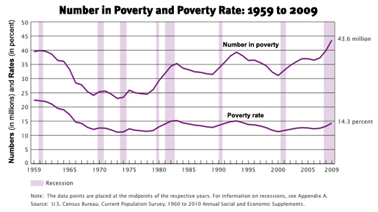
The larger story, which I outlined in a recent 10-part Slate series (PDF; serial version; slide show), is that income inequality in the United States has been growing for three decades. Since the early 1990s, the main driver of income inequality has been skyrocketing incomes at the top. But during the recession the main driver appears to be an increase in the poverty rate steeper than anything we've seen since 1994. (See accompanying chart.)
What's interesting about the 'alternative measure' Yen used is that it (or something like it) happens to be favored by conservatives (and also some 'nonideological' contrarians like Georgetown economist Steven J. Rose, author of Rebound, and Reuters blogger Gregg Easterbrook, author of Sonic Boom) who argue that all this talk about income inequality is overblown. To me, the news in the AP story isn't "Income Inequality on Rise". Rather, it's "Inequality Minimizers and Deniers Hoist by Own Petard."
It was a matter of personal pride, when I wrote my Slate inequality series, that I never burdened readers with the unlovely phrase 'Gini coefficient'. Now, alas, I can't avoid it. The Gini coefficient (or Gini index) is the principal means by which economists measure income inequality.
Its inventor was an Italian statistician named Corrado Gini (1884-1965), whose lesser works (let me say it before Jonah Goldberg does) include a 1927 paper titled "The Scientific Basis of Fascism." Gini's coefficient (whose use is not confined to economics) measures dispersion. The index runs from zero (perfectly equal distribution) to 1 (maximum possible unequal distribution). In economics, the higher you score on the Gini index, the more unequal your society's distribution of income.
In the United States, the Gini index was 0.468 in 2009. By the standards of other leading industrialized nations, that's pretty bad. It's worse than Germany (0.27), worse than France (0.327), worse than the United Kingdom (0.34), worse than Italy (0.32), worse than Spain (0.32), worse than Sweden (0.23), worse than Japan (0.381), worse than Israel (0.392), and worse than the entire European Union (0.31). The countries that are worse than the United States (Central African Republic, 0.613; Zimbabwe, 0.501) tend to be pretty uncongenial.
But the United States may be an even bigger outlier than these numbers suggest, because the Gini coefficient has certain disadvantages when it comes to measuring rapid income growth at the tippy-top of the income scale. Indeed, the Sept. 16 Census report says the Gini index has experienced no statistically significant changes since 1993, which is about when income gains for people who make more than $1 million per year began their present rapid acceleration. The Gini index doesn't reflect that. The lone exception to the Gini flat line during the Clinton years and after was a 1.5 percent decrease between 2006 and 2007.
Why did the AP's Yen write that income inequality increased between 2008 and 2009 when the Census was saying it didn't? Because Yen wasn't going by the standard measurement. Instead, her calculations were— sorry, here comes more jargon— 'equivalence-adjusted'.
The Census Bureau's standard measure of income inequality is based on 'household' incomes. For sticklers, that's problematic because a household can be a sprawling family of 12, or it can be a single elderly retiree. Different groupings require varying quantities of cash to get by. That's often why those who deny or minimize the income inequality claim that the official numbers are illegitimate. When you factor in differences in household size and circumstance, they say, income inequality is not as bad. They're right.
To answer this criticism, the Census published, alongside its standard calculation, a separate calculation that was 'equivalence-adjusted'. The Census's equivalence-adjusted measure of income inequality factored in the number of people occupying a household and also took into account three key variations: children consume less than adults; a single parent's first child costs more than a couple's first child; and as families grow, they realize certain efficiencies of scale. By this unofficial measure, which is what the AP's Yen chose to use, income inequality is not as great as it is by the Census' standard measure. The Gini coefficient isn't 0.468; it's 0.458.
But that's not the end of the story. When you calculate using equivalence-adjusted data, income inequality is shown to have grown at a much faster rate over the past three decades than it is when you calculate using the Census' standard measure. Since 1967, the Gini index has increased 23.8 percent using equivalence-adjusted income, compared to a 17.9 percent increase using the standard measure. The equivalence-adjusted method shows inequality to be growing more rapidly in the short term, too. So while the Census' official measurement shows the Gini index remaining the same between 2008 and 2009, the equivalence-adjusted measurement favored by the AP's Yen shows the Gini index increasing from 0.451 to 0.458. That's statistically significant, according to the Census.
I don't pretend that this revelation about equivalence-adjusted income will silence the small band of people dedicated to arguing that income inequality is a 'minor' problem at best. But it ought to give them some pause when they consider that their preferred measurement shows income inequality to be accelerating more quickly than we (or they) previously knew.
ߧ
Normxxx
______________
The contents of any third-party letters/reports above do not necessarily reflect the opinions or viewpoint of normxxx. They are provided for informational/educational purposes only.
The content of any message or post by normxxx anywhere on this site is not to be construed as constituting market or investment advice. Such is intended for educational purposes only. Individuals should always consult with their own advisors for specific investment advice.
No comments:
Post a Comment