Click here for a link to ORIGINAL article:
By William Hester, CFA | April 2009
All rights reserved and actively enforced.
Reprint Policy
|
Whether it was William Peter Hamilton observing the trading activity of the 19th century, or Richard Russell who has studied the market's real-time price and volume action for more than 50 years, or Russell Napier who took the time for an in-depth review of the 4 greatest buying opportunities in the 20th century, each came to a similar conclusion: to confirm a change in market conditons, watch trading volume closely. By this measure, the market's recent rally still has much to prove.
The graphs below attempt to provide visual support to the idea that volume matters as a characteristic of a rally— especially one that is so widely annointed as the beginning of a new bull market. The graphs will hopefully also add to the comments John Hussman has made— including those in last week's Green Shoots over Thin Ice and December's Recognition, Fear and Revulsion. Specifically, bear markets don't typically end in a crescendo of fear and panic, but more often on a feeling of "despair and disillusionment," while strong bull markets tend to feature heavy trading volume.
In each of the charts below the blue dates represent the beginning of each bull market since 1940. The red dates represent this decade's bear-market rallies, including 4 during the 2000-2003 bear market and the rally that lasted from November of last year through January.
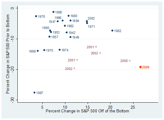
In the first graph below, the vertical axis shows the 4-week percent change in the S&P 500 beginning a month prior to each trough in the market. It attempts to capture how sharp the final move was to the low. The horizontal axis shows the 5-week change in the S&P 500 off of the bottom. It attempts to measure the intensity of the rally that followed.
Data that fall in the upper left portion of the graph represent periods where the market bottomed with little fanfare, and the rally that followed was similiarly uninspiring. Data that fall to the bottom right represent periods where a sharp rally off of the bottom approximated the severity of the preceding decline.

Click Here, or on the image, to see a larger, undistorted image.
To some extent, all stock market bottoms carve out a ‘V' bottom. Prices move lower, and then change direction. But look at the clump of blue data points in the upper left portion of the graph. These aren't the capitulations that most investors have in their minds when they think of a classic bear-market V-bottom. The bulk of bear markets have ended by falling less than 10 percent in the final month— and were followed by similiarly modest moves off of the bottom.
There are exceptions which include 1987 and 1998. But those corrections were sharp and condensed. Even so, they were both followed by tepid rebounds in the initial upswing.
Look at the bear-market rallies in red. The characteristic that these periods share is that they frequently carve out an acute bottom— a capital ‘V' to the typical bear-market bottom's lowercase ‘v'. In each of the 5 cases, a sharp condensed decline created an oversold condition, which was then followed by a similarly powerful rally.
Since it's unknown whether the recent advance is a rally within a bear market or the beginning of a new bull market, the market's performance in 2009 is denoted in orange. It sits far away from the blue data points, and shares its space with the 5 previous bear-market rallies. And while much has been said about the strength of the rally this year, the graph shows that it's consistent with the severity of the decline that preceeded it. The S&P 500 fell 26 percent from it's peak in January to the March low. It's rallied since March by roughly the same amount.
This is not to say that the market never rallies strongly at the beginning of a bull market. During the first weeks of the bull markets beginning in 1971, 1982, and 2003 the market rallied impressively in a short period of time. But an important distinction is that the approach to their final lows was distinguished by a more moderate decline when compared with each bear market rally.
Missing Volume
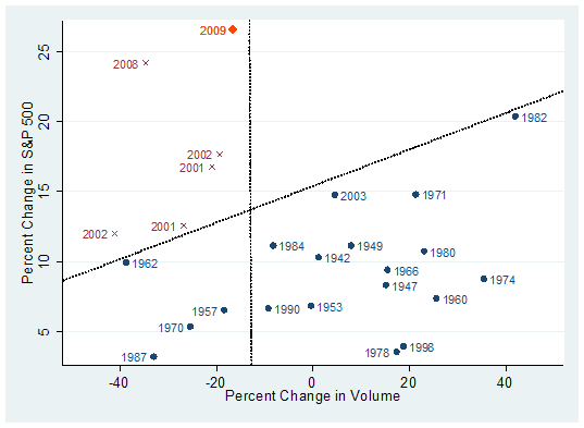
The second characteristic of a trustworthy bear-market bottom is that the rally that follows tends to coincide with a healthy increase in volume. The chart below again shows all of the bear-market bottoms since 1940 in blue and the 5 most recent bear-market rallies in red, along with this year's advance. This time the vertical axis measures the 5-week percent change in the S&P 500 from each bottom. The horizontal axis measures the 5-week percent change in NYSE volume (smoothed). The two dotted lines group the data into three separate areas.
Data points that fall in the upper left portion of the graph represent powerful rallies on contracting volume. Data points that fall in the lower right portion of the graph represent steadier advances with increasing volume or slightly contracting volume. The lower left portion represents bull-market bottoms that began with contracting volume.

Click Here, or on the image, to see a larger, undistorted image.
It appears that bear-market rallies like to stick together. Here you can see the characteristics these rallies share include strong (even if temporary) returns with contracting volume. Each had strong returns within the first 5 weeks of the rally— and most went on to gain more than 20 percent before rolling over. But it's important to note that volume waned during each of these rallies. And for the most part, the larger the contraction in volume, the more quickly the rally tended to lose steam.
The characteristics of this year's rally are interesting. It's the strongest 5-week rally over the entire data set— even with contracting volume. One positive we can note is that the volume is contracting on this rally less than it contracted in last year's bear-market advance. But the market has also run up strongly on volume that would be unusually weak for a bull market advance of this size.
You can see what most initial bull advances look like in the lower right part of the graph. Except for 1982 and to a lesser extent 1971 and 2003, bull markets tend not to be explosive in their first couple of weeks. And when they are, the moves tend to coincide with a similarly explosive increase in volume. NYSE volume grew by 40 percent in the first 5 weeks or so off of the 1982 bull market. At an S&P 500 dividend yield of nearly 7%, stocks were cheap and investors showed their conviction.
This is not to say that bear-market bottoms can't occur on low or contracting volume. They can, as is shown in the lower left portion of the graph. The bear-market bottoms of 1957, 1962, 1970, and 1987 all began with unimpressive amounts of volume. But they also share another characteristic— early returns were muted. The bull markets that did begin on low volumes didn't have explosive beginnings.
Recruiting Volume
If March 6th proves to be the bottom of the market, Anatomy of the Bear author Russell Napier can put off his next edition for awhile because the most recent bear market won't qualify as a great bottom. That's because even though the market's decline since 2007 has been one of the largest on record, it didn't bring the market to truly great values. In his analysis of the stock market bottoms of 1921, 1932, 1949, and 1982 Mr. Napier chose to use two measures to gauge the valuation of the market.
One was Robert Shiller's PE ratio based on trailing earnings. As I noted in Market Valuations During U.S. Recessions, this ratio has fallen to the mid-single digits during periods of extreme undervaluation. It's currently 15. The second valuation tool Mr. Napier used was the q-ratio, a measure of market valuation relative to the replacement cost of assets. Deep undervaluation for this measure tends to be when market prices are roughly 35 percent of replacement costs. According to the most recent data the q ratio is about twice that.
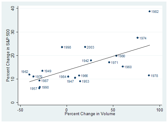
An important observation that Mr. Napier makes in his studies of the most damaging bear markets is that even if the initial move off of the bottom is lacking volume, once a new higher level is reached, the market should begin to attract buying interest. In each of the bottoms he studied, volume expanded noticeably after the initial rally. This idea also holds up for the majority of bear-market bottoms. In the graph below the axes are the same as the graph immediately above. The vertical axis shows the percent change in the S&P 500 while the horizontal axis shows the percent change in volume. But this time the period is 6 months from each bear-market bottom.

Click Here, or on the image, to see a larger, undistorted image.
The line that fits the data slopes upward, implying that the more robust a rally is during the first six months, the better the improvement in volume. Here the bear-market bottoms of 1982 and 1974 stand out. Both provided strong returns that coincided with equally impressive improvements in volume. The periods of 1974 and 1982 are examples where ‘revulsion' and deep undervaluation can combine to create a powerful base from which bull markets launch.
Contracting volume is not enough evidence to qualify that this is a bear-market rally with certainty. There are other measures that are showing more strength— such as various indicators of market breadth. [[But, on the other hand, this market has been marked by unusual wide (negative) market breadth on the way down.: normxxx]] But new bull markets, whether at their inception or soon after, have a history of recruiting noticeable improvements in volume. So far this rally lacks that important quality. Over the next few weeks stock market volume will be a metric to watch closely.
No comments:
Post a Comment